How to Improve Text on Z-Image Turbo?

Creating posters, invitations, and announcements with Z-Image Turbo can be exciting, especially when the composition, lighting, and overall output come out great. But one area that many users still struggle with is text accuracy. Even with strong prompts, Z-Image Turbo can sometimes miss letters, rearrange characters, or slightly distort words.
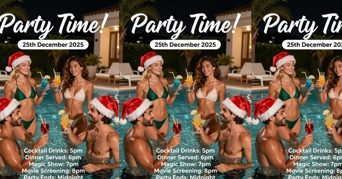
A good example comes from a user who tried to make a Christmas pool party invitation using the bf16 version of Z-Image Turbo with Qwen3 4B as the text encoder. The images looked great, the concept was captured well, and the layout worked but the text on the poster didn’t fully match the prompt.
Even after testing different schedulers (Euler+Simple, Euler A+Beta, DPM 2++ SDE + SGM Uniform) and raising steps from 9 to 15, the text still didn’t consistently come out clean.
So the question is: Can we improve text output on Z-Image Turbo? Or is this simply a limit of the model?
Why Text Still Struggles
Z-Image Turbo can produce clean shapes, objects, faces, and scenes, but text involves tight character placement and strict spelling. Since the model was not trained as a typography specialist, it sometimes slips when too many lines are included.
Words with repeated letters, similar shapes, or uncommon letter pairs tend to distort.
Long posters with multiple bullet points also increase the chance of small errors.
How to Improve Text Output
Here are actionable methods you can try to get better results with Z-Image Turbo.
1. Shorten each line of text
Breaking long sentences into shorter fragments helps. Instead of a long block, try:
- “Please bring”
- “towels”
This reduces the pressure on the model to handle long strings at once.
2. Give spacing instructions
Try adding to your prompt:
- “Clear large text spacing”
- “Text should be sharp and readable”
- “Bold typographic style”
While not guaranteed, it nudges the model toward cleaner characters.
3. Increase font focus in the prompt
You can add:
- “Clean lettering”
- “Poster typography focus”
- “Readable block text”
This helps the model treat the text area as an important part of the composition.
4. Reduce the amount of text on the canvas
Too much text lowers accuracy. If your layout includes many items such as:
- Cocktail Drinks: 5pm
- Dinner Served: 6pm
- Magic Show: 7pm
- Movie Screening: 8pm
- Party Ends: Midnight
- Please bring towels!
…then errors become more likely.
Try moving some parts to a shorter description or separate clusters.

5. Try a higher step range (20–30)
Even though steps from 9 to 15 didn’t help, Z-Image Turbo usually responds better when you go 20–30 steps, especially for text-heavy prompts.
6. Reduce CFG
For text, lower CFG often helps the model stay closer to the prompt. Try 2.0–3.0, as many Z-Image users report stronger results with lower CFG.
7. Keep the poster layout simple
Too many objects Santa hats, drinks, pool, lights, people, Christmas elements, can crowd the scene and leave less “attention space” for text accuracy.
Simplifying the layout gives text more clarity.
8. Make one area dedicated to the text
Examples of what helps:
- “Top section: title text only”
- “Middle section: event details arranged neatly”
- “Bottom section: final line with clear spacing”
Direct instructions like these help the model structure the layout properly.
My Experience With Text on Z-Image Turbo
From multiple tests, I found that Z-Image Turbo does best with:
- fewer lines of text
- simpler fonts
- clear instructions for spacing
- lower CFG
- more steps
It still isn’t perfect for long, detailed posters, but the improvements can be noticeable.
Should You Just Add Text Manually?
If your goal is full spelling accuracy, manual editing will always be the safest option. But if you want Z-Image Turbo to handle the entire poster independently, the methods above will help you get closer to clean results.
Z-Image Turbo can create impressive layouts for invitations, party announcements, and decorative posters and with the right adjustments, you can get cleaner, more readable text without jumping into Photoshop.
Recent Posts

Z-Image-De-Turbo de-distilled variant of Z-Image
Z-Image-De-Turbo: A de-distilled variant of Z-Image-Turbo for flexible training, LoRA development, and extended experimentation without adapters.

Z-Image Turbo ControlNet Workflow
Tutorial on Union ControlNet in ComfyUI—pose, Canny, and depth controls, depth-model preprocessing, step-by-step workflow, plus speed tests with example results.

Zimage Turbo Beats FLUX 2: Local AI Image Generation
Meet Tongyi/Alibaba’s Zimage Turbo: stunning local AI image results with sharp anatomy. See examples and get the ComfyUI workflow that outshines FLUX 2.
Comments
Loading comments...